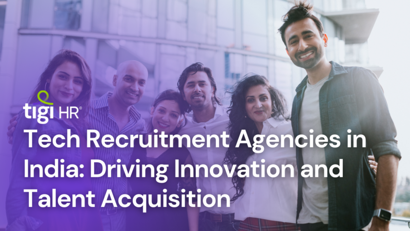
At TIGI HR, branding is more than just a visual identity—it’s a reflection of our values, mission, and the essence of what we stand for: empowering talent through innovation and integrity. Today, we proudly unveil our newly refreshed logo and brand identity, designed to speak directly to our audience, while positioning TIGI HR as a leader in the recruitment industry.
Brand Tonality: A Foundation of Team, Talent, and Technology
TIGI HR’s tone of voice is built around three key pillars: team, talent, and technology. These elements drive our approach to building long-term trust with clients and candidates. Our brand is not just about filling positions; it’s about creating sustainable relationships that benefit both sides of the talent equation. To maintain this tone of voice, we focus on three operational principles: speed, scale, and surety. This ensures we deliver timely, scalable, and reliable recruitment solutions across all sectors.
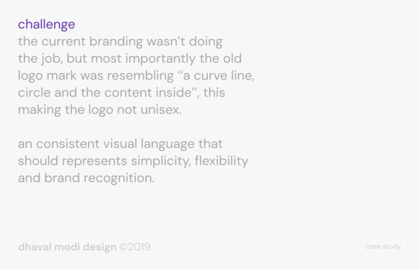
The Challenge: Moving Beyond Outdated Symbolism
Our previous branding failed to capture the essence of what TIGI HR stands for today. The old logo, which featured a combination of a curve, a circle, and content inside, lacked inclusivity and didn’t resonate across diverse demographics. The unisex nature of our brand is crucial—especially in an industry where the majority of HR professionals are women. The previous logo leaned too much toward a masculine aesthetic, which created a disconnect with our core audience.
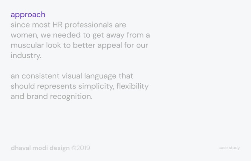
Our Approach: A Visual Identity for the Modern HR Professional
With a majority of HR professionals being women, we recognized the need to move away from a muscular or overly rigid visual identity. Instead, we embraced a simpler, more flexible design that better represents our industry. The goal was to craft a consistent visual language that speaks to our core values: simplicity, flexibility, and brand recognition.
The new logo symbolizes more than just a company—it represents a bridge, connecting professionals faster and more efficiently while maintaining high standards of quality. It reflects perpetual creation—the ongoing evolution of the recruitment process, and our commitment to helping businesses and individuals grow.
Mood and Audience Insight: The 3 Ps of TIGI HR
In developing our new brand identity, we conducted thorough research to better understand the mindset of our target audience. Three recurring qualities stood out: professionalism, progressiveness, and passion. These traits are embedded in the DNA of our new branding, ensuring that TIGI HR’s visual identity aligns with the aspirations and attitudes of those we serve.
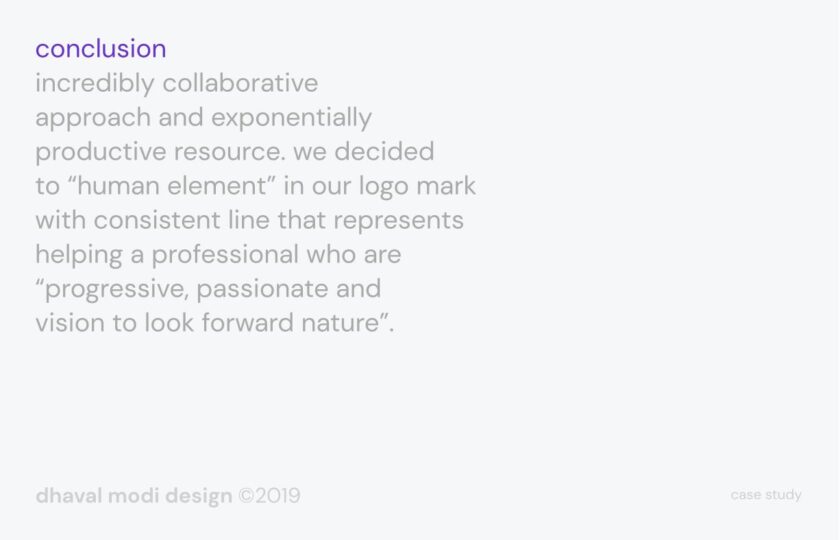
The Conclusion: Human-Centric and Forward-Looking
Our collaborative approach to rebranding was highly productive, leading to a design that emphasizes the human element. The consistent line in the logo represents our commitment to helping professionals who are progressive, passionate, and visionary, always looking toward the future with a growth mindset.
The icon reflects TIGI HR’s belief in simplification and imagination, and embodies the concept of a strong bridge—a metaphor for how we connect talent and businesses swiftly and effectively. This new symbol showcases how we transfer quality resources from one end of the industry to another, with a focus on speed, efficiency, and reliability.
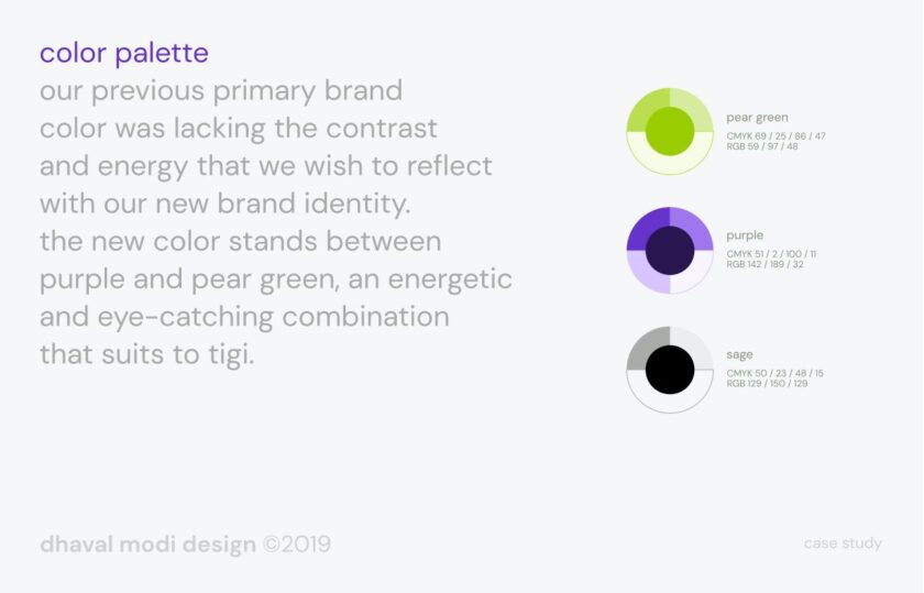
Colors: A Reflection of Energy, Wealth, and Success
Our previous brand color lacked the contrast and energy we needed to truly stand out. The new color palette, a combination of purple and pear green, is bold and eye-catching—perfectly suited to TIGI HR’s dynamic and forward-thinking identity.
- Purple reflects creativity, wisdom, and ambition, symbolizing the thoughtful and strategic approach we bring to recruitment.
- Pear green signifies wealth, growth, and prosperity, aligning with our mission of connecting resources that help organizations and individuals navigate their path to success.
These colors reflect TIGI HR’s role as a catalyst, helping our clients move from dark to light—from uncertainty to success—faster than ever.
The Conclusion: Human-Centric and Forward-Looking
Our collaborative approach to rebranding was highly productive, leading to a design that emphasizes the human element. The consistent line in the logo represents our commitment to helping professionals who are progressive, passionate, and visionary, always looking toward the future with a growth mindset.
The icon reflects TIGI HR’s belief in simplification and imagination, and embodies the concept of a strong bridge—a metaphor for how we connect talent and businesses swiftly and effectively. This new symbol showcases how we transfer quality resources from one end of the industry to another, with a focus on speed, efficiency, and reliability.
Colors: A Reflection of Energy, Wealth, and Success
Our previous brand color lacked the contrast and energy we needed to truly stand out. The new color palette, a combination of purple and pear green, is bold and eye-catching—perfectly suited to TIGI HR’s dynamic and forward-thinking identity.
- Purple reflects creativity, wisdom, and ambition, symbolizing the thoughtful and strategic approach we bring to recruitment.
- Pear green signifies wealth, growth, and prosperity, aligning with our mission of connecting resources that help organizations and individuals navigate their path to success.
These colors reflect TIGI HR’s role as a catalyst, helping our clients move from dark to light—from uncertainty to success—faster than ever.
A New Era for TIGI HR
TIGI HR’s rebranding is more than just a change in logo; it’s the beginning of a new chapter in our journey. The refreshed brand identity underscores our commitment to being progressive, human-centric, and innovative in everything we do. With this transformation, we’re ready to continue building long-lasting relationships, creating value for businesses and professionals alike, and helping the world’s best talent and companies connect in meaningful ways.
TIGI HR isn’t just about recruitment—it’s about building bridges to the future.
𝗙𝗼𝗻𝘁 𝗙𝗮𝗺𝗶𝗹𝘆 : DM Sans
Download high resolution logo file : Media Kit
Follow us on LinkedIn : TIGI HR Solution Pvt. Ltd.®